Introduction
For one of our customers we needed to create customized reports that could not be easily implemented by using standard Power BI components. We explored different ways how to create reports. One of the possible way was usage of Deneb.
What Deneb is
Deneb is a custom visual allows you to create your own graphical representation of your data. Deneb uses two visualization grammars called Vega and Vega-lite. Vega-lite provides simpler notation how to describe chart. Simplicity means that not all details can be customized. Notation of Vega is more complex, but it can allow to customize your charts in higher deep.
Installation
There are two ways how to install Deneb visual. First source is from Microsoft AppStore and second is downloading file from GitHub
AppStore version has some limitation such as forbidden loading pictures from URL.
Basic visual elements
The entire notation is written in JSON format and consists of many elements.
Header
Chart size setting
“$schema”: “https://vega.github.io/schema/vega/v5.json”,
“description”: “Elections to the Chamber of Deputies 2021”,
“width”: 1024,
“height”: 500,
“padding”: 5,
Data
Dataset is the name of the default data source. More data sources can be defined and new data sources can be derived from them through various transformations (filtering, aggregation, etc.).
“data”: [{“name”: “dataset”}],
Signals
Signals have the function of variables that can be used to set the display of the resulting graph. At the same time, signals can be used to capture mouse, keyboard, etc. events.
“signals”: [
{
“name”: “shape”,
“value”: “circle”
},
{“name”: “shapeSize”, “value”: 475},
{“name”: “icon”, “value”: “image”},
{
“name”: “hover”,
“value”: null,
“on”: [
{
“events”: “@poslanec:mouseover”, — hovering the mouse over the @poslanec object (picture of a member of parliament)
“update”: “datum”
},
{
“events”: “@poslanec:mouseout”, — leaving the mouse of the @poslanec object
“update”: “null”
}
]
},
{
— title change triggered by mouse event
“name”: “title”,
“value”: “Elections to the Chamber of Deputies 2021”,
“update”: “hover ? hover.Strana :
‘Elections to the Chamber of Deputies 2021′”
},
{
— display of the number of mandates triggered by a mouse event
“name”: “stranaCount”,
“value”: “”,
“update”: “hover ? hover.PocetOrig : 200”
}
],
Scales
Scales are used to map values from a table to a graph (x, y, z axis) and graphic entity properties (object size, color). We can imagine the domain, for example, as the x-axis, onto which all values from the table need to be mapped using scales.
“scales”: [
{
“name”: “xscale”, — axis “x”
“type”: “linear”, — how to map values to an axis
“round”: true,
“nice”: true,
“zero”: true,
“domain”: {
“data”: “dataset”,
“field”: “AxisX” — column
},
“range”: “width”
}
]
Axis
Assigning the defined scales to individual axis and configuring the visual properties of the axis.
“axes”: [
{
“scale”: “xscale”, — defined scale
“orient”: “bottom”,
“title”: “AxisX”
}
],
Legends
Chart legend settings
“legends”: [
{
“stroke”: “color”,
“fill”: “color”,
“symbolType”: {“signal”: “shape”}, — configuration variable with type of symbol
“title”: “Strana”
}
],
Marks
Settings of the graphic visualization and assigning the defined elements (scales, axes, signals) to the graphic entity. Encode block sets the position of the graphic entity in the chart such as color, size, text alignment, etc.
“marks”: [
{
“name”: “poslanec”, — picture of a member of parliament
“type”: “image”,
“from”: {“data”: “dataset”},
“encode”: {
“update”: {
“shape”: {“signal”: “shape”}, — type of graphic shape
“url”: {“field”: “Img”}, — link to picture
“size”: {
“signal”: “shapeSize”
},
“fill”: {
“scale”: “color”,
“field”: “Strana”
},
“tooltip”: {
“signal”: “datum”
},
“stroke”: {
“scale”: “color”,
“field”: “Strana”
},
“x”: [ — mapping of axis “x”
{
“scale”: “xscale”,
“field”: “AxisX”
}
],
“y”: [ — mapping of axis “y”
{
“scale”: “yscale”,
“field”: “AxisY”
}
],
“zindex”: [ — mapping of axis “z” (picture overlaying)
{
“scale”: “zscale”,
“field”: “AxisZ”
}
]
}
}
}
]
Config
Additional visual configuration
“config”: {
“axis”: {
“grid”: false,
“ticks”: false,
“labels”: false,
“domain”: false,
“titleColor”: “white”
}
}
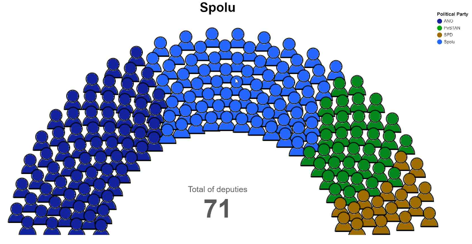
Example of custom chart
It is a graphical representation of Czech elections to the Chamber Deputies in 2021.
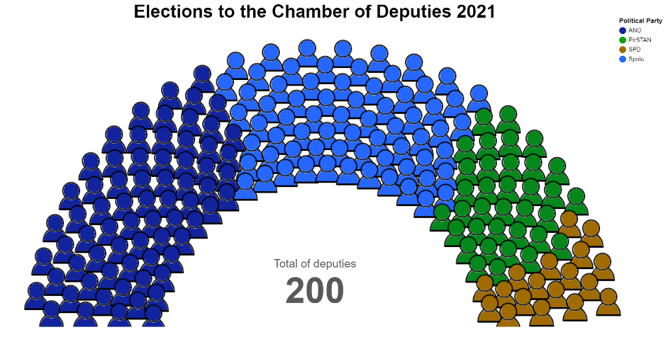
If you hover your mouse point on a section of some political party then chart title and count of deputies are updated.
Conclusion
At the end we recommended a paid component to our customer, which seemed us more suitable for him. Deneb is an interesting technology for creating advanced or unconventional graphs. It is definitely worth considering and exploring. When you create a report it is necessary to expect a higher time requirement than in the case of standard or paid third-party components.
Related links
https://vega.github.io/vega/docs/
https://vega.github.io/vega/examples/

I am a long time IT fan focusing on databases and data processing. I am interested in both on-premises and cloud technologies. Currently I am working on increasing my knowledge in Azure Synapse Analytics and Databricks.